How To Use the StoryBrand Framework To Create a Landing Page That Converts
Here’s the truth: companies often waste money on digital marketing and even developing other marketing collateral. They waste money on marketing that does nothing to make the customer want to engage with their brand.
What businesses don’t realize is that people don’t buy the best products, they buy the ones that are communicated the clearest.
One of the most important marketing tactics your business can leverage to communicate to customers is your website.
In this article, we will explain:
- Core concepts of communicating clearly to your audience
- How the 7 point StoryBrand framework can increase conversion
- How to create a compelling landing page using this framework
So, let’s dive in!
Core Concepts of Communication
The average customer sees about 3,000 advertisements a day 😱.

In order to break through the noise, your messaging needs to be clear and memorable. The ads that get remembered and noticed are the ones that customers can understand the fastest.
The first step to creating marketing that cuts through the noise is understanding how the brain processes information.
Understanding the Human Brain
The human brain only cares about two things:
- Helping you survive and thrive
- Conserving calories
Your marketing needs to explain to people how you can help them survive and thrive. Otherwise, their brain will shut out the information.

If your marketing is overly-complicated, they will have to exert a lot of energy to understand it. Therefore, the brain won’t even try to understand in order to conserve calories.
Don’t Suffer From the Curse of Knowledge
Don’t project your knowledge of your product, service, or value onto your customer. You spent years working in your business, and your audience may just be hearing of you.
Communicate your customer’s needs and your value clearly and in a way that is easy to understand. The average viewer has an 8th-grade reading level or lower.
Telling a Story is the Most Powerful Tool
Storytelling compels and captivates the human brain.
The brain spends 30% of time daydreaming. You need to tell a story that is captivating enough to get your customers’ attention.
So, how do you tell a story?

7 Point StoryBrand Framework
All compelling stories follow a formula. If you look closely at any blockbuster movie, you are likely to see them using this formula.
Example:
Let’s look at Harry Potter. After all this 7 book, 8 movie series has made J.K. Rowling a (very) rich woman.

- Hero – Harry Potter
- Problem – Death Eaters are attacking and Harry becomes worried about his friends’ well-being. There is also an overarching problem of good versus evil.
- Villain – He who shall not be named
- Guide – Harry has many guides throughout the series, including ones he doesn’t realize (Professor Snape), but the two main guides are Hagrid and Headmaster Dumbledore.
- Stakes – The Wizarding World can be taken over by Voldemort and the Death Eaters, but if Harry succeeds, there can be harmony.
- CTA – His dreams of Voldemort were the first time he realized there was a problem occurring and that he was the one who needed to take action.
When you read the books or watched the movies, you were instantly drawn into the captivating story, excited for the next one to come out. You want your customers to feel the exact same way about your marketing content.
Here is the 7 point StoryBrand framework you need to follow for your marketing messaging.
1. Character
Despite popular belief, your customer is the hero of your story- not you. From our example above, Harry Potter is your customer.

Understand who your customer wants to be and how you can help them get there. They want to reach their aspirational identity, and you are participating in their transformation.
Their aspirational identity can also be defined by how they want others to see them. This is especially important if you are a B2B business because you are helping them to be seen positively by their customers.
Being there for their transformation will bond you and create customer loyalty.
2. Problem
You want to be known by your customer for solving a problem. The only reason consumers buy anything is if they are trying to solve a problem.
If you can get your business to come to mind when your customer experiences a specific problem, you will have a customer for life.
There are 3 types of problems:
- External – physical problem that manifests the internal problem
- Internal – how the hero feels about the external problem
- Philosophical – good vs evil, why the problem is just plain wrong
Solving all three problems using the StoryBrand framework creates satisfaction and makes customers brand evangelists.
You want to be able to solve all problems with one direct CTA.
Pro tip: Create a villain. This will help bond you with your customers. After all, the enemy of their enemy is their friend.

3. Guide
As we mentioned before, your customer is the hero. So where does that leave you in the story?
You are the guide. The one who cares about their problem and gives them the guide to solve it.
In order to position yourself as the guide, you want to show empathy and authority. People want someone who cares about their problems and has the competency to solve them.
But while you are talking about yourself to explain why they can trust you, you should still focus it around their needs.
4. Plan
Now is when the customer is going to start to make excuses for why they can’t buy-in.
The main two excuses usually are:
- This is too hard
- This is too confusing
The solution? Give them any easy plan i.e. “The Plan”.

The plan should have 3 easy steps that they can take to reach success. Three is the best number for engagement because, after that, each additional step decreases engagement.
Simple buy-ins lead to more buy-ins.
5. Call To Action (CTA)
All CTAs must be clear and concise. Otherwise, the customer won’t know what action you want them to take, and therefore they will do nothing.
An inciting incident is what is used in stories and movies to get the hero into action.
There are two types of CTAs:
- Direct
- Transitional
Most people won’t want to do the direct call to action- they would want to start with transitional. This nurtures the relationship so that they trust you and will later want to follow the direct CTA.
4 things a transitional CTA should do:
- Slowly bring people to your product or service
- Position you as the guide
- Create reciprocity – give something of value for free
- Stake claim to your territory
Common mistake: People are too afraid of being salesy and therefore leave off a call to action. You need to tell the viewers that you want them to buy something.

(Source)
The direct CTA should be on the top right corner of the page and should be repeated as they scroll through the landing page. This will ensure that the user sees the CTA and that you get the most out of the StoryBrand framework.
6. Stakes
While marketers are often afraid of being too negative in their ads, you want to point out some possible negatives. What will happen if they continue to not take action. Customers are highly motivated by loss aversion.

In a study done by advertisers, 47% saw an increase in their CTR when they implemented negative content.
What loss are your customers avoiding by working with your brand?
Warning: If you scare them too much, they will disengage.
7. Vision of Success
People wanted to be taken somewhere, especially if it is towards success.

As we mentioned earlier, you do not want to assume that people know how your business can add value. You need to tell them.
You can use words and visuals to help show how you will solve their problems.
Unlike the negative section, you can’t overdo success. So, say it over and over again to drill it into their minds.
Build Landing Pages Using Storybrand Framework
When a visitor comes to your website, they often look at it the same way.
They want to immediately know what you do and what value you provide to them.
Now, before we go into the framework, here are some common mistakes we see on websites or landing pages:
- Don’t clearly say what your company does
- Use images that don’t reflect your message
- Use insider language
- Includes too much text
- Wastes words
- Overwhelms customers with too much information
- Doesn’t have a CTA
Remember: you only have a few seconds to capture their attention and convince them to keep reading.
Viewers often skim websites, so make sure you include clear section headers.
Pro tip: Look at your website like your customer does. Pretend you don’t know anything about your company.
Now that you understand the StoryBrand framework, here is the landing page framework you need to follow based on the framework.
1. Header
The term header refers to everything above the fold, as in everything the audience can see at the top of the page before scrolling.
The purpose of your header is to get people to read the rest of your website.
The header should contain the character’s aspirational identity and how you can help them get there.
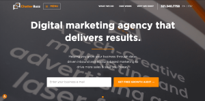
(Source)
You want to make a good first impression, and the best way to do that is to clearly answer 3 questions:
- What do you do?
- How does it make the customer’s life better?
- How do they get it?
Remember the Z formation?
The top left has your company’s logo. The top right has the direct CTA. The middle peaks curiosity and across the bottom is the value stack.
The CTA should be bold and use active language.
Common Header Mistakes
- Use of vague language. People often dance around what they do in order to sound smart and edgy. If the customer can’t clearly tell what your business provides they will leave your page.
- Defining too many things your customer wants. Pick one main aspirational identity. You want it to be easily memorable so that the customer can identify it with your brand.
2. Stakes
What are the stakes in their decision to work with your business? What will their life be like if the customer doesn’t buy your product/service?
You want to ramp up the problem by showing your customer how bad they have it.
Bring up the 3 problems;
- external
- internal
- and philosophical.
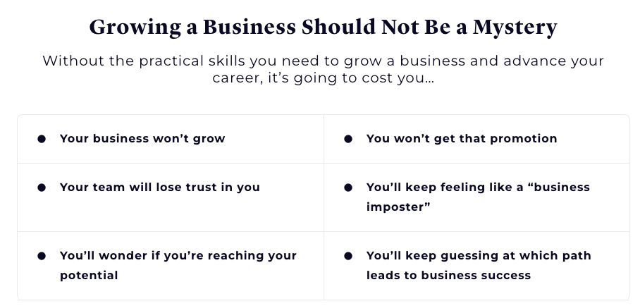
(Example of a Stake section)
This section can lean towards the negative but remember you do not want to overdo it.
3. Value Proposition
Repeat the value stack from the header. The value stack is the benefit the customer receives by working with you.
As an example below are the Values we provide here at Chatter Buzz.
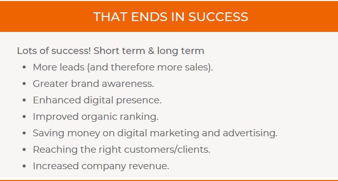
You will want to choose values that the customer is willing to pay for.
Make sure you explain the value you give the customer simply and clearly.
Then, include the direct CTA again.
4. Guide
Here is where you express empathy and authority.
Tell the reader that you care about them and their problem. Then explain what you can do to help the customer solve the problem.
You can show authority through media quotes, awards/certification, testimonials, and statistics.
This is not a backstory on your company or a place to brag. While you are talking about yourself the focus should still be the customer.
5. The Plan
Demonstrate how easy it is for them to work with you and solve their problem.
Clearly show the 3 step plan using visuals. You want to keep it as simple as possible as to not deter them from taking action.
For example:
- Fill out the form to schedule a meeting (or whatever direct CTA you are using)
- Meet with a representative
- Watch your business thrive
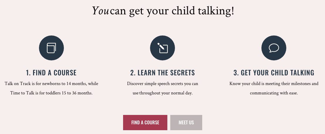
The final step should always use success language.
6. Explanatory Paragraph
By including an explanatory paragraph, you can overcome the biggest objection your customer may have or answer any questions you think they may be wondering.
Again, this is is not your backstory section.
You are explaining the details of the solution to their problem.
While your copy is the most crucial part of the landing page, you want to still optimize it so it can be found by your customers. Therefore, this is the area where you should include your SEO keywords.
This will be the longest section of your StoryBrand framework. If you want to keep the page short, you can hide part of the text within a “read more” button.
7. Lead Generator
Advertise a free lead generator that will bring value to your customer.
This shows your customers that you can provide them with solutions and create reciprocity. They feel like they owe you for giving them this free help.
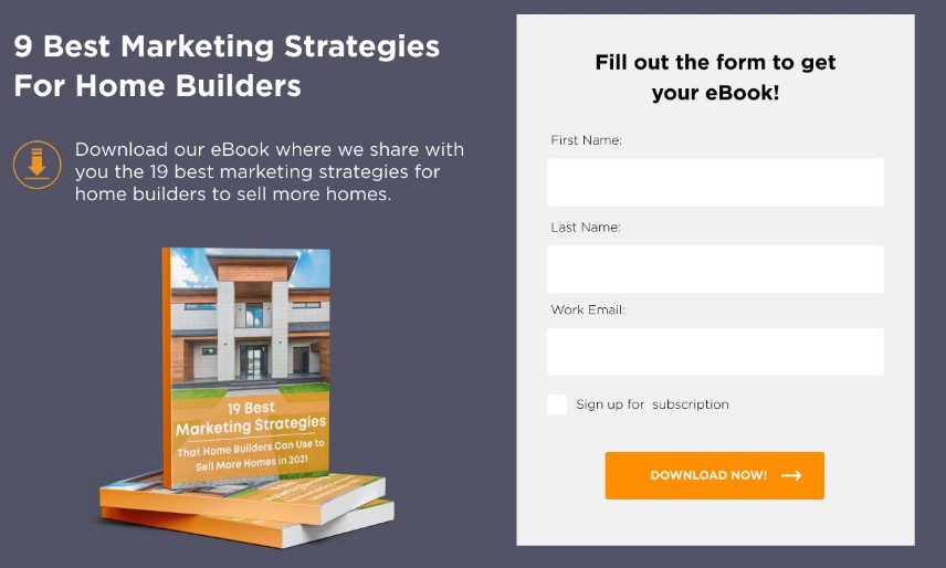
You can have this as a section and/or a pop-up. Discuss the value they receive and then ask them to give their email in order to access it.
This can work as a transitional CTA that nurtures your relationship with your customer.
8. Video (Optional)
It is important to have a good title that makes them want to click to watch it. Not just “About Us.’
Explain what value this video is providing and what they will get out of watching it.
You want to keep your video short because most viewers do not have a long attention span. In fact, you only have about 8 seconds to capture their attention and convince them to keep watching. The recommended maximum length of a video is 3 minutes.
This section is optional because you don’t want to force a video if it won’t provide any added benefit.
9. Product/Price Choices (Optional)
If you have several service plans or products, here is where you can list the most popular.

(Example)
Give a brief explanation of their value and then direct the user to learn more by visiting the service or product page.
You can also take this time to explain your pricing plan if you have multiple options.
10. Junk Drawer
Here is where you put everything else that you want to include on your page.
For example, you can have:
- About Us
- Contact Us
- FAQ
- Career Opportunities
- Link to latest blogs
This way, they can find the information if they’d like to do more research, but they don’t have to wade through too much information on the page.
Create a Landing Page That Converts With Chatter Buzz
Ready to create a landing page that converts visitors into customers?
At Chatter Buzz, we can help you create landing pages that tell a compelling story.
Our content marketers have undergone extensive training and are certified in the StoryBrand framework. Whether you need help crafting a messaging strategy, creating content, or designing a landing page, our strategists are here to help.
Contact us to claim a free website growth strategy session with one of our strategists!


